Tuesday, 11 December 2012
Monday, 10 December 2012
Further print tests


Printing tests for event guides

I printed out the formula 1 event guides to assess how the layout worked as it would be a printed final piece this would make a big difference. I immediately noted too many words per line which I thought reduced readability so decided to split it into two columns. Also I decided that the photos should be in black and white so that the only colour would be that of the map. There also needed to be more detail on the map so I created some symbols that would help someone find their way around.
The heirachy of the headers too were not strong enough and therefore did not create an obvious stand out as important information so I altered this and added colour and changed the typeface to bold.

I also removed the logo at the top and replaced it with a headline to allow the event information to be made relevant with a date too.
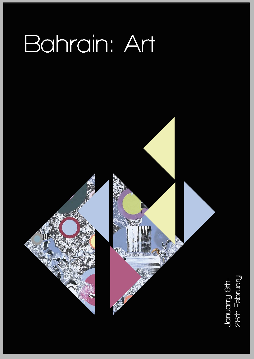
ART and FOOD
Continuing with the use of the logo I wanted to create event guides that were specialist to certain sectors. I didn't want to show the full images and so I cut out a sector of the image with the triangles from the logos then used more of the logo as an overlap to bring out the colours of the image.


For the reverse I have used one of the colours from the front to highlight the more important parts of the text. I think this also links the front and the back together.

I decided not to use this style for the Grand Prix due to that needing to have more information and be separate and more important in design. The white writing on black is not as readable as the black on white especially the map which is important for that guide.
Sunday, 9 December 2012
Website development, concept confirmation
I want the concept of this sector of the business to work online and with the app. This will allow the company to ensure that the information will be constantly updated and I think this is key. Especially with regards to students.
I wanted to keep some consistency with their its nice that website. The horizontal navigation bar also seemed more appropriate.
This allows for a blog like update for each event with representative dates.


I think this layout is too erratic and so this website needs more development on the grid and layout to ensure consistency.

Im not sure if its a good idea to have a website that has buttons on both the left and at the top but this is the website and homepage I am going to add for submission of this module however I hope to adapt this and make a much more user friendly website. I think the concept it good so it will be worth the time amending these things for the competition submission. 

Further work on app

I had been struggling with creating the app to look like it was interactive, however I think this works better by combining images text and arrows...
Subscribe to:
Posts (Atom)