Showing posts with label manrepeller. Show all posts
Showing posts with label manrepeller. Show all posts
Tuesday, 11 December 2012
Sunday, 9 December 2012


Further Proposals
I have recently been considering how I could take this project further, as I don't have very much time left I don't think I could really start them but I have been considering proposing a charity fashion show for Leandra Medine to sell her clothes and her friends too.
This event could give me the opportunity to diversity her branding specifically for an event and create a range of different outcomes such as wayfinding/signage for the event, invitation, brochure for the event, promotion for the event.
This event could give me the opportunity to diversity her branding specifically for an event and create a range of different outcomes such as wayfinding/signage for the event, invitation, brochure for the event, promotion for the event.
Printed resolutions//final outcomes


Ben, Sam, Emily and I tried to do this all together so we could help each other with ideas for layout and lighting etc and so it took quite a while as a group and also we found it a lot harder to get good consistent results however there were a few shots that I was happy with and some that I would have to edit as best I could for my boards.
Invoice

I thought that it was important to mock up an invoice slip for the mock ups of the packaging. I have used the layout of the letterhead to ensure continuity and then entered the relevant information. I think it was important for me to include information about the return of the items. I have made this document quite formal as I want to give authenticity to a purchase as well as a personal touch with the other note. I think this will not be printed on the same stock as everything else, however for the photography of the range I probably will so it follows the terms of everything else.
Note from Leandra Medine and the importance of showing her personality through the branding

This note is a traditional A6 format which suits her classic tastes and my main intention for the use of this is for Leandra to write a hand written note for each of the purchases thanking the consumer for the purchase and to mention where the money is going from each of the sales.
I have decided to not have a patterned back as I want this note to be un complicated with no fuss.
However if it doesnt seem to fit with everything else I will consider altering this accordingly.
INSERT IMAGE OF PRINTED VERSION
Envelope
I started designing for the envelope by working out a net from drawing out the style of envelope that I wanted to produce. As mentioned before it is the subtlety of this design with involving the printed pattern inside the envelope.


This was my original net which I then printed to realise that the window was on the wrong side of the design and if it was placed here then the window would be found on the back of the net.
This amended I then sent it to print.


Business card


From these stock tests I decided that the layout was well suited to what I wanted and the choice of stock for my final pieces would be the textured watercolour stock due to the added texture it made the type more interesting. As I didn't have the time/opportunity to do any embossing or debossing which is what I think this card would need I decided this added something else to the final outcome. The colour was something else I considered, the other two options were either too cream or too plain with the white. The texture added a depth of colour to the white.
Letter head
These are the letterheads that I designed the logo to sit on the left similarly to the website however I think that fact that its so big and the opacity is a little too high it interferes with the body text of the letter. This is something that I think needs changing, however I next tried out the logo at a a larger scale to see that maybe if there was more of it then there would seem like there was less noise.


The outcome of this is shown here:

For this final outcome, which I think is the most successful, has been altered to ensure that the logo on the right is in line with the bodytext. This creates a neat outcome that is not too much especially considering the fact that the back will be black with the logo repeated.

Stationary
I have decided to take Leandra Mendine's branding further and so I am designing for her stationery range I hope to create:


 This is the net for the envelope however I need to add a cut out for the front of it. I didn't want to have an outside pattern as I don't think it would be that effective. By applying the pattern to the inside of the envelope it gives a less obvious hint to the branding.

- letterheads
- envelopes
- business card
- promotional posters and cardholder (which may be used for a receipt or note in packaging)
I'm going to continue with using the repetitive logo is a pattern this will be foiled with gloss to. The key to this branding is for continuity and that everything to reinforce the logo especially as it's not that readable. This is some feedback however I think it's important for this logo not to give too much away.

When designing for the foiling on black stock it needs to be black designs on white for the printer to print in black. This is where the foil will stick to.
The above designs are for the back of the business cards and the letterheads, these designs are not very complicated but I've needed to continue with the same aesthetic that I've adopted for the other things such as packaging.
 This is the net for the envelope however I need to add a cut out for the front of it. I didn't want to have an outside pattern as I don't think it would be that effective. By applying the pattern to the inside of the envelope it gives a less obvious hint to the branding.
Here is a mock up for the initial designs of the stationary. I will however be re-designing each of the things after doing print tests.
This module for me is an experimentation and I will design then print to see the results.


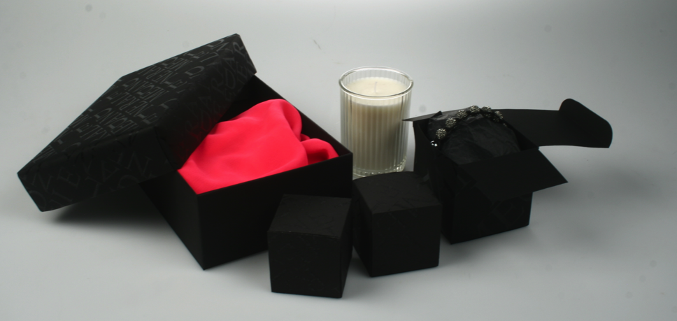
Final boxes/need to photograph properly


I had two final sizes for this box and so tried to take some photos in the studios. Despite being happy with the outcomes it became apparent that I needed to seriously work on my product photography. These really didn't work very well, so I am going to book into the photography studios and try to improve on these (not hard I'm sure)
Stock options
I've previously mentioned some of the problems that occurred during printing and one of them was finding out that I can print on a super card I could only print on a four so compromise had to made and so the larger box has been made black paper however I would have preferred it if they had all been printed on the same stock, the black card. I didn't try any other colours due to the fact I think black work well the reasons previously mentioned.
Sales page


By using the same template this part of the design was not too complicated to use the two pages the sales page the top page is the first page and then the second one is for the actual page per item this includes three images of the product and the details of sale. I need to work on this especially the details parked on the right. This also needs to include a buyer button service at the moment a working progress. But I think that by deciding on a template it makes this a lot more consistent and simple to design for.
Final homepage website

This is my final website and the homepage for Leandra Medine.
I intend to use this template for the sales page and further necessary pages.
Website redesign
From looking at the current website of the Manor pellet one of the initial problems I saw was how it was mainly image-based but you could only see four images per page and that the viewer would have to keep scrolling back through pages and pages. This is something I've noticed in tumbler accounts and other fashion blogs however more research on this is my context blog.
When designing the website there were certain things in life that were important:


 I wanted to start this designing process on initiator creating a timeline effect of homepages I think this is the most beneficial way for me to design as I can see and experiment with what works and what doesn't.
I started this part of designing through the list above and also from looking at a lot of websites and working out what I liked and why I liked them this can be seen on my context blog.
 I have created these templates as an example of how I wanted to organise the images. I think this blog is mainly image-based so this is a key part of my designing a think it's important to compromise on how many images per page. It's important to have enough to keep the look interested but not to have that many that the images lose strength. These three grids are to help me organise the layout. The top one maybe lacking in variation which is why designed the middle one however the smaller boxes at the bottom may be too small to work.

 This website was my first and the most simplistic due to the fact I wanted to get things down which I could then experiment with. You can see that typeface was something that I wasn't sure of, to stick with something serif or two create a secondary online typeface for the brand. I used the same headings and tabs as her current website is did not think these need changing. Another plus point from these is that they can continue with her tone of voice, which is important for me to retain as I think it's her bestselling point the most interesting factor.
This next website mockup is similar to the last but puts a pattern, which has been developed from the packaging on the back of the website. Visit this works out well as it reduces the whitespace and detracts from the interests of the photographs.

In the next website mockups I did is considering putting the man repellener logo with the Leandra Medine one too. I was trying to apply simplicity to the website. It was also important to experiment with whether or not each image will have a caption or date of rollover bar. From this website I discovered and decided that a serif typeface, in this case Times new Roman was relevant as it was the same typeface used in the logo. I don't think it needed a sans serif typeface.

Referring back to the first website mockup I wanted to comment on the most positive aspects the white space was used well however, the tabs at the top seems to spaced out.I'd also been working with greys under the impression that when rolled over they would turn black.
I now wanted to try and incorporate the logo in a repetitive way, I had done this before but the entire background and I think this is necessary as it creates a very busy outcome.

So I decided to create the header bar the width of the logo, also from looking at other websites adding dashed lines help separate the page and didn't mean that the tabs top were so on their own.
One thing I noticed was that when having a lot of photos on the page there were also a lot of colours this is something that I don't think work that well because it created a website with less impact than if there were only a few colours.

So therefore on the next page I created colour to be only seen on the most recent blog post. This will also change if the user scrolled over the other pictures then they would also be in colour too.
I also shifted the control bar to the left rather than at the top which thing worked well however I had left the border of logos at the top which didn't seem to work with the rest of the layout..

I want to continue to experiment with the logo and so enlarged it quite considerably to put behind the page is a constant. Although the legibility of this is not that obvious by now I think I have developed it enough and plan to use it so broadly that just some of the logo scene will be enough to be recognised in context.
 I've also put the title for a blog post in lowercase with each of the photos as to give the viewer some idea as to what each blog post is about as some of the photos aren't that clear.
I was still unsure about the navigation bar being top so tried it in a box to be in keeping with the rectangular nature of the website. By keeping me straight lines there will be a juxtaposition against the logo which was slanted. The serifs on the logo also worked well against straight lines of the rest of the layout.
 I separated the boxes into four separate boxes which the tabs the navigation bar I think this is neater however needs to be aligned with the rest of the columns to comply with the grid prescribed.
 Here I experimented with pulling the images to the top of the page to see how worked with further imagesOn the screen, however I think this compromise with the whitespace factor and how I think this would create a page With perhaps too much on.
 Here I have created a neater navigation bar which includes the tabs and social media links in one block. This allows that the more whitespace top and a larger logo to be shown side with more of the logo actually showing too.
Next I wanted to look at interchanging homefront is with multiple images playing through I suggested this with arrows however I'm unsure how relevant this is for this subject matter. I think I may use this in the self sales page to allow the reader to flick through different images.

 I have here reduced the number of images on this page but there is the play button which could be continuously changing allowing the viewer to see more images than if it was static. However I think the sidings for these images are quite small which leaves a little too much white space and kind of leaves the page fairly empty and lacking interest.
 The smaller logo that the straighter angle has been adopted here but I think it separates the page too much and doesn't link between the navigation bar and the photos.
 Here I was worried that the logo was too dark incomplete that and so I change the opacity and also put three images both sides of the interchangeable central image. I like the layout of having images both sides and also like the size of the images however the logo is still dark.
 Here I have reduced the opacity of the larger logo and then placed the straighter logo on top of however but I think this works as it clashes and create a bit too much noise in the top left when there's so much going on with the images.
 Here I have added the search bar and title ' the man repeller' to the website which a thing works well and is dynamic but also allows the reader to browse the page without complications or extra added noise.
When designing the website there were certain things in life that were important:
- clean aesthetic
- whitespace
- limited colour
- reinforce branding
- easily navigated
- uncomplicated
- professional


I started this part of designing through the list above and also from looking at a lot of websites and working out what I liked and why I liked them this can be seen on my context blog.
 I have created these templates as an example of how I wanted to organise the images. I think this blog is mainly image-based so this is a key part of my designing a think it's important to compromise on how many images per page. It's important to have enough to keep the look interested but not to have that many that the images lose strength. These three grids are to help me organise the layout. The top one maybe lacking in variation which is why designed the middle one however the smaller boxes at the bottom may be too small to work.
 This website was my first and the most simplistic due to the fact I wanted to get things down which I could then experiment with. You can see that typeface was something that I wasn't sure of, to stick with something serif or two create a secondary online typeface for the brand. I used the same headings and tabs as her current website is did not think these need changing. Another plus point from these is that they can continue with her tone of voice, which is important for me to retain as I think it's her bestselling point the most interesting factor.
This next website mockup is similar to the last but puts a pattern, which has been developed from the packaging on the back of the website. Visit this works out well as it reduces the whitespace and detracts from the interests of the photographs.

In the next website mockups I did is considering putting the man repellener logo with the Leandra Medine one too. I was trying to apply simplicity to the website. It was also important to experiment with whether or not each image will have a caption or date of rollover bar. From this website I discovered and decided that a serif typeface, in this case Times new Roman was relevant as it was the same typeface used in the logo. I don't think it needed a sans serif typeface.

Referring back to the first website mockup I wanted to comment on the most positive aspects the white space was used well however, the tabs at the top seems to spaced out.I'd also been working with greys under the impression that when rolled over they would turn black.
I now wanted to try and incorporate the logo in a repetitive way, I had done this before but the entire background and I think this is necessary as it creates a very busy outcome.

So I decided to create the header bar the width of the logo, also from looking at other websites adding dashed lines help separate the page and didn't mean that the tabs top were so on their own.
One thing I noticed was that when having a lot of photos on the page there were also a lot of colours this is something that I don't think work that well because it created a website with less impact than if there were only a few colours.

So therefore on the next page I created colour to be only seen on the most recent blog post. This will also change if the user scrolled over the other pictures then they would also be in colour too.
I also shifted the control bar to the left rather than at the top which thing worked well however I had left the border of logos at the top which didn't seem to work with the rest of the layout..

I want to continue to experiment with the logo and so enlarged it quite considerably to put behind the page is a constant. Although the legibility of this is not that obvious by now I think I have developed it enough and plan to use it so broadly that just some of the logo scene will be enough to be recognised in context.
 I've also put the title for a blog post in lowercase with each of the photos as to give the viewer some idea as to what each blog post is about as some of the photos aren't that clear.
 I was still unsure about the navigation bar being top so tried it in a box to be in keeping with the rectangular nature of the website. By keeping me straight lines there will be a juxtaposition against the logo which was slanted. The serifs on the logo also worked well against straight lines of the rest of the layout.


 Here I have created a neater navigation bar which includes the tabs and social media links in one block. This allows that the more whitespace top and a larger logo to be shown side with more of the logo actually showing too.
Next I wanted to look at interchanging homefront is with multiple images playing through I suggested this with arrows however I'm unsure how relevant this is for this subject matter. I think I may use this in the self sales page to allow the reader to flick through different images.


Subscribe to:
Posts (Atom)