websites & links//quotes // advice from this years first years
I started to brainstorm what theme to follow with, deciding to concentrate on escapism...I wanted to select images that depict this and translate to good/thick stock.
Following Fred's advice ("The worst thing you can do is not start") I began to experiment with layers and photographs of scenic images.


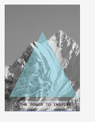

I started by being inspired by some work (as seen in my design context) that incorporated mountains and scenic imagery. At first I thought how this could work well as part of my escapism, however, others have mentioned that by using a mountain it could represent the 'climb' and hard work. All of this is very metaphorical and although it works, I think aesthetically, it works too. Using images I found I started to experiment with colours and shapes, playing with layering and the effects.
I started with these bright circles (seen above), it looked far too obvious and was not what I liked or was aiming for, I then edited the photo to black and white and took from the colours of the sky/snow/mountain. Colder colours...


I really like the three circles and how it gives the sense of the mountain but only gives a hint of the colour. I then built on my intention to inspire and entered the text 'THE POWER TO INSPIRE'.
As this would be a freshers' pack, from the college I wanted to build on the main thing that I have got from being here. Despite learning a huge amount, what this course and college has done is inspire me. Through the briefs and being in studios, inspiration has been a huge part of my first year.

Above is shown my further exploration, I put a brown, very transparent rectangle over the image to see how the photograph would look in a sepia toned setting...I didn't like it.


I then tried printing out a few experiments, this highlighted how poor the quality the photograph was. So I went back and found a better quality image. I preferred this one due to the trees adding another dimension and grounding the image slightly. So as an A5 card, the eye was lead up to the number more discretely.
I wanted to put a piece of large text over the mountain so decided by labelling the cards it would create a distinction between each card.


I wanted to start layering up circles and adding different textures... the swirl also works well for bringing the eye across the page.


I added this (horrible) green strip to try and help weight the bottom , however it was removed pretty quickly!


With the use of indesign I started to organise a template for how I wanted the text to look. I wanted to keep the overall layout of the reverse side of the card quite minimal and clean looking. When looking at it, I didn't want the new students to be daunted but to like the neat, clean look and utilise the information given.


...Trialling other images and varying effects.


I wanted to use a different image for the 3rd card, if I had planned my time better, I would have liked to progress this final card more, into a larger poster or something else, as it doesn't work that well (for obvious reasons) with the other cards it would have been nice to make it something different.
No comments:
Post a Comment